

Welcome to Bouncie’s Brand Resources
We’ve created these guidelines to ensure a consistent, clear, and impactful representation of our mission to connect people with their vehicles in smarter, safer, and more meaningful ways.
Logo
Our logo is a key brand asset and should be used consistently across all materials. Below you’ll find guidelines for usage of our logo.
Download Logo Pack
Logo Colors
The logo should primarily be used in its full-color version. When this isn't possible, use the white logo against a legible background color.

Full-color

White on primary blue
White on black
Sizing
To ensure clarity and consistency in all our communication materials, we’ve established a standard set of logo sizes. While these sizes may not fit every application, they provide a reliable starting point for similar, high-visibility touchpoints.


100px
On-screen minimum size


1”
Print minimum size
Readability
When placing a logo on a background, use a contrast ratio of 3:1 or higher to ensure legibility. If you are using a colored background, always use the white logo.


0% Black
Contrast ratio = 4.82:1

25% Black
Contrast ratio = 2.62:1
50% Black
Contrast ratio = 1.22:1
75% Black
Contrast ratio = 4.82:1
100% Black
Contrast ratio = 4.36:1

#14946B
Contrast ratio = 3.83:1
Logo Don’ts
To maintain the integrity of the Bouncie brand, it’s important to use the logo correctly and consistently. Avoid altering the logo in any way, such as changing its colors, distorting its proportions, adding effects (like shadows or gradients), or placing it on busy or low-contrast backgrounds. Always use approved logo files to ensure the brand remains recognizable and professional.

Don’t modify the logo colors

Don’t stretch or distort the proportions

Don’t add effects

Don’t rotate the logo

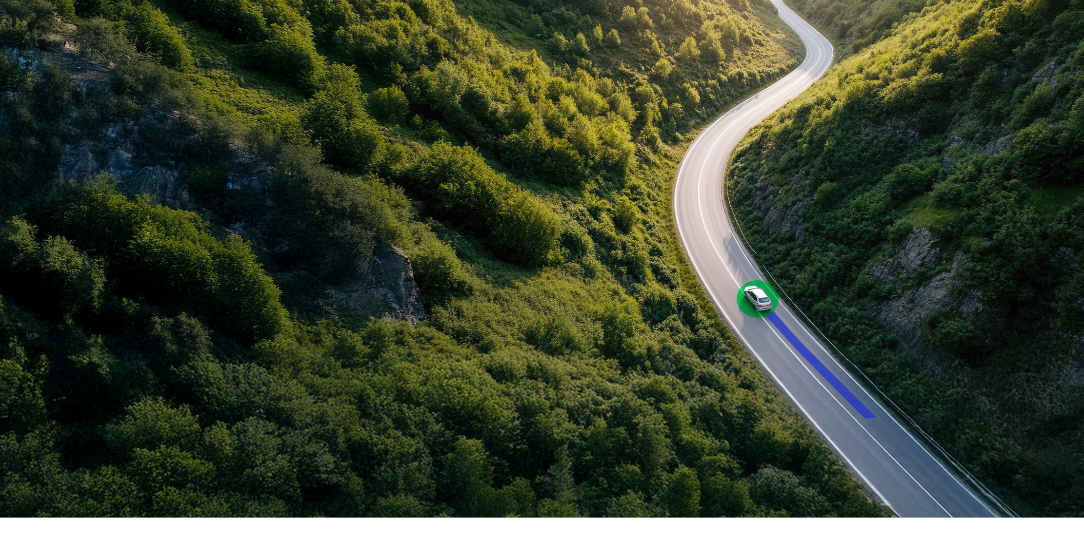
Don’t place on busy backgrounds
Edu
Don’t create your own logo combinations
Don’t put the blue logo against a colored background, even if it meets contrast requirements. Only use white on colored backgrounds.

Don’t place on low-contrast colors
Welcome to Bouncie’s
Brand Resources
We’ve created these guidelines to ensure a consistent, clear, and impactful representation of our mission to connect people with their vehicles in smarter, safer, and more meaningful ways.
Logo
Our logo is a key brand asset and should be used consistently across all materials. Below you’ll find guidelines for usage of our logo.
Download Logo Pack
Logo Colors
The logo should primarily be used in its full-color version. When this isn't possible, use the white logo against a legible background color.
Full-color
White on primary blue
White on black
Sizing
To ensure clarity and consistency in all our communication materials, we’ve established a standard set of logo sizes. While these sizes may not fit every application, they provide a reliable starting point for similar, high-visibility touchpoints.
100px
On-screen minimum size


1”
Print minimum size
Readability
When placing a logo on a background, use a contrast ratio of 3:1 or higher to ensure legibility. If you are using a colored background, always use the white logo.
0% Black
Contrast ratio = 4.82:1
25% Black
Contrast ratio = 2.62:1
50% Black
Contrast ratio = 1.22:1
75% Black
Contrast ratio = 4.82:1
100% Black
Contrast ratio = 4.36:1
#14946B
Contrast ratio = 3.83:1
Logo Don’ts
To maintain the integrity of the Bouncie brand, it’s important to use the logo correctly and consistently. Avoid altering the logo in any way, such as changing its colors, distorting its proportions, adding effects (like shadows or gradients), or placing it on busy or low-contrast backgrounds. Always use approved logo files to ensure the brand remains recognizable and professional.
Don’t modify the logo colors
Don’t stretch or distort the proportions
Don’t add effects
Don’t rotate the logo
Don’t place on busy backgrounds
Edu
Don’t create your own logo combinations
Don’t put the blue logo against a colored background, even if it meets contrast requirements. Only use white on colored backgrounds.
Don’t place on low-contrast colors